Many Thanks to Mike Wilson, from Yorkshire in the UK, for sending in this story.
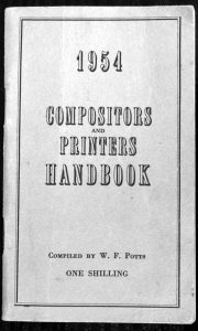
This 104-page booklet was full of tables and facts for the printing trade.
Following a diary, there were tables for working out night rate payments, starting from £6 10s 6d (£6.51) per week. Then followed four pages of the correct symbols for correcting proofs, and more pages on casting off for Monotype composition. Casting off enabled one to find how many lines would fit a certain page depth.
Sizes of cards were given as well as figures for the calculation of income tax. Facts about poster work, punctuation and foreign currency followed.
Imposition was explained at length and included section heads of Signatures, Gutters, Backs, Heads, Tails and Off-Cuts. Imposition was a skill I never mastered.
Book Founts
Near the end of the book there were pages of book founts from the Stephenson Blake and Caslon foundries: Old Style, Plantin, Bodoni, Modern No.17, Modern No.20, Caslon Old Face, Perpetua, Verona, Cheltenham, Baskerville, Bell, Bembo, Blado, Centaur, Ehrhardt, Fournier, Garamond, Gill, Goudy, Imprint, Lutetia, Poliphilus, Rockwell, Romulus, Scotch Roman, Times, Van Dijck and Walbaum. Some of these typefaces have all but disappeared, but to the man in the street they all look like this font (Baskerville).
The typeface Times Roman was designed to fit the narrow columns of newspapers, and is now a default font for newspapers and magazines. I prefer Antiqua as it is a little wider and I like my work to be a little different. Antiqua is a ‘serif’ typeface, while Arial is ‘non-serif.’ Serifs are the small finials to the letter. Serif fonts have characters which vary in width, while sans serif do not.
